Background
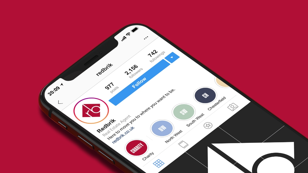
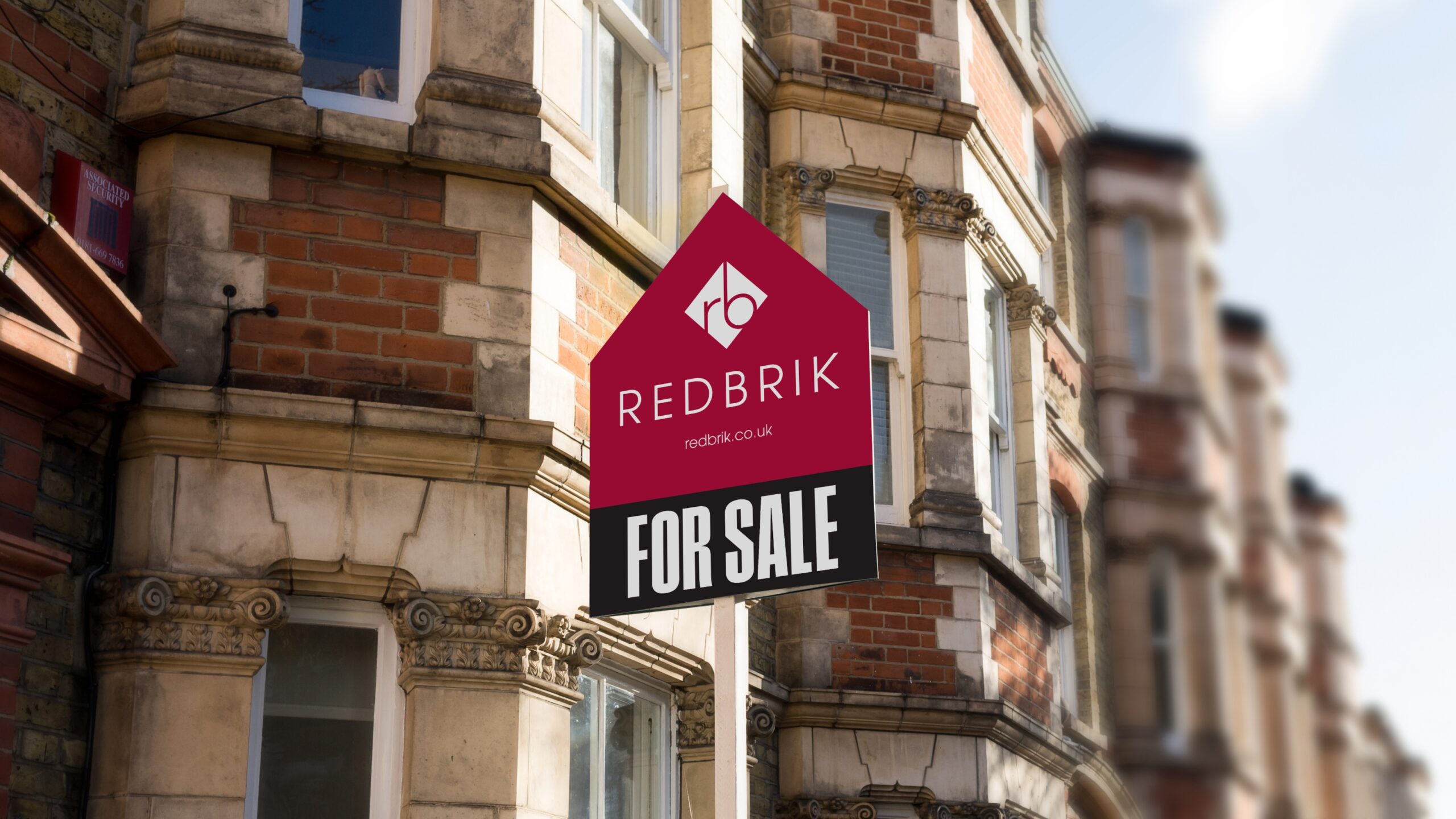
Redbrik, one of Sheffield and North East Derbyshire’s leading estate agents, undertook a brand refresh to bring greater cohesion to their brand identity, whilst also expanding the visual and graphic language throughout the brand.
Process and Outcome
The project involved making small but significant changes to the established brand identity with the aim of preserving pre-existing brand equity.
The changes included the recreation of the Redbrik diamond brandmark, resulting in a more balanced mark, whilst also customising the Redbrik logotype to increase legibility.
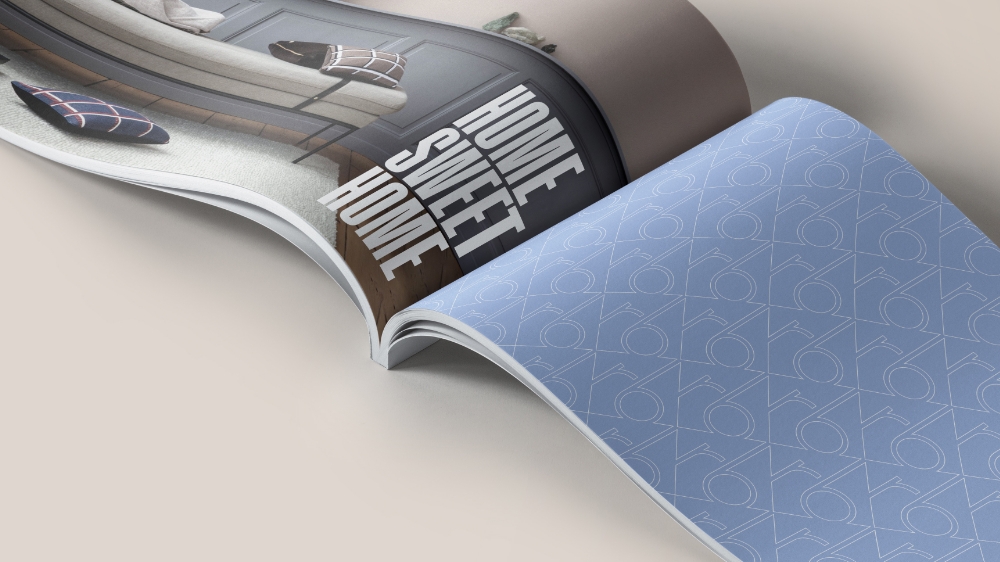
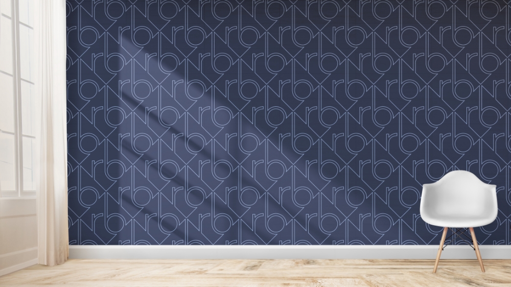
A secondary font and refreshed colour palette were also introduced to provide more depth, flexibility and diversity across a wide range of brand communications.