Background
Hallam Towers is a unique collection of luxury apartments located in the leafy Sheffield suburb of Ranmoor. The signature, luxurious style of Hallam Towers is brought to life on the site of the once majestic and iconic Hallam Towers Hotel with a large selection of high-end one, two and three-bedroom apartments.
Process and Outcome
Working from a brief set by selling agent Redbrik to create a brand that reflects the opulent nature of this landmark development in one of Sheffield’s most affluent neighbourhoods, the Hallam Towers brand was developed around a ‘H’ monogram that employs negative space to subtly suggest the ‘T’ of ‘Towers’. This provides a callback to the glamour of the Art Deco movement of the early 1920s, which is further echoed in the interior design direction of internal communal spaces, such as the lobby and concierge areas.
The mixed typography of the logotype provides a blend of tradition with the use of STIX Bold, a serif font that is used to typeset ‘Hallam’, which is offset by Gotham Regular, a contemporary sans serif font that the word ‘Towers’ is set in, that is used to anchor the logo lock-up.
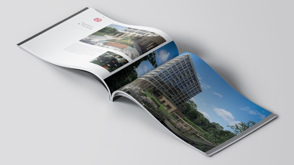
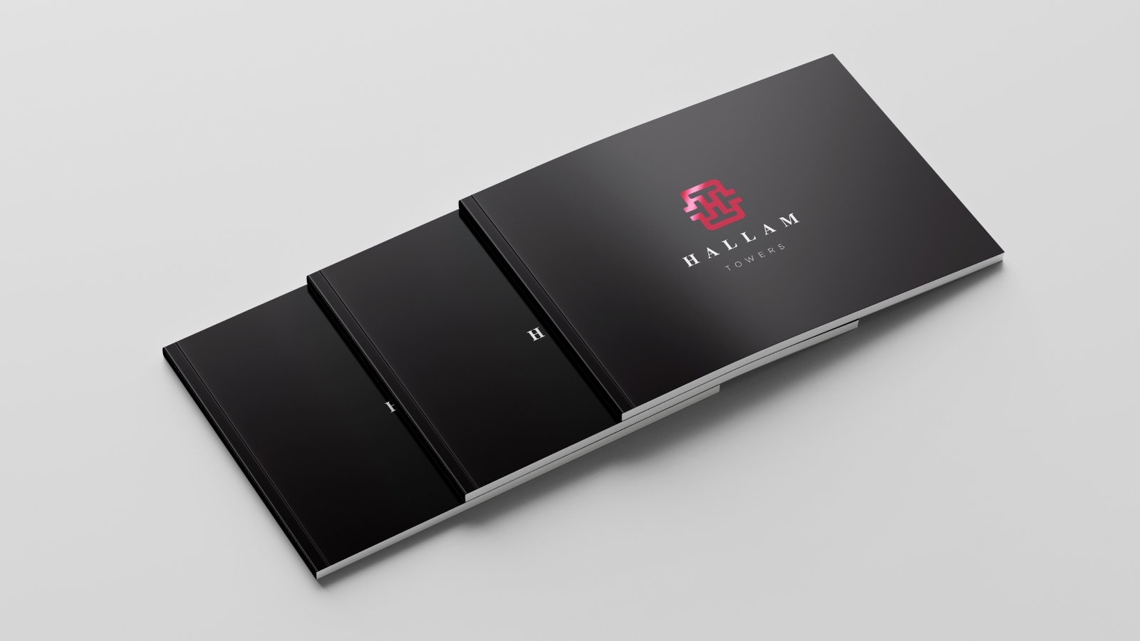
The brand was developed into supporting marketing materials, including a 56-page brochure which incorporates G.F Smith’s Colorplan Ebony as the choice of stock for the cover, with bespoke foils applied to the brand monogram and logotype, to provide a further suggestion of the luxury residential offering available at Hallam Towers.


