Background
Following a brand audit, Mayfair-based law firm Gillen De Alwis Solicitors embarked on a rebrand, designed to better position the firm with key clients, particularly those located in affluent areas of North London.
Process and Outcome
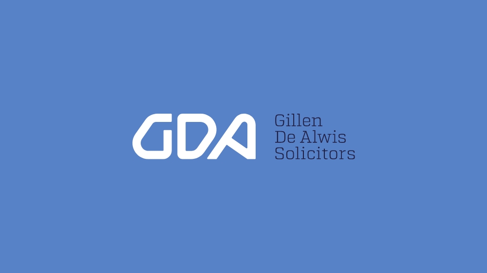
The logo lockup is designed to reflect the innovative and forward thinking approach that GDA has to working with clients.
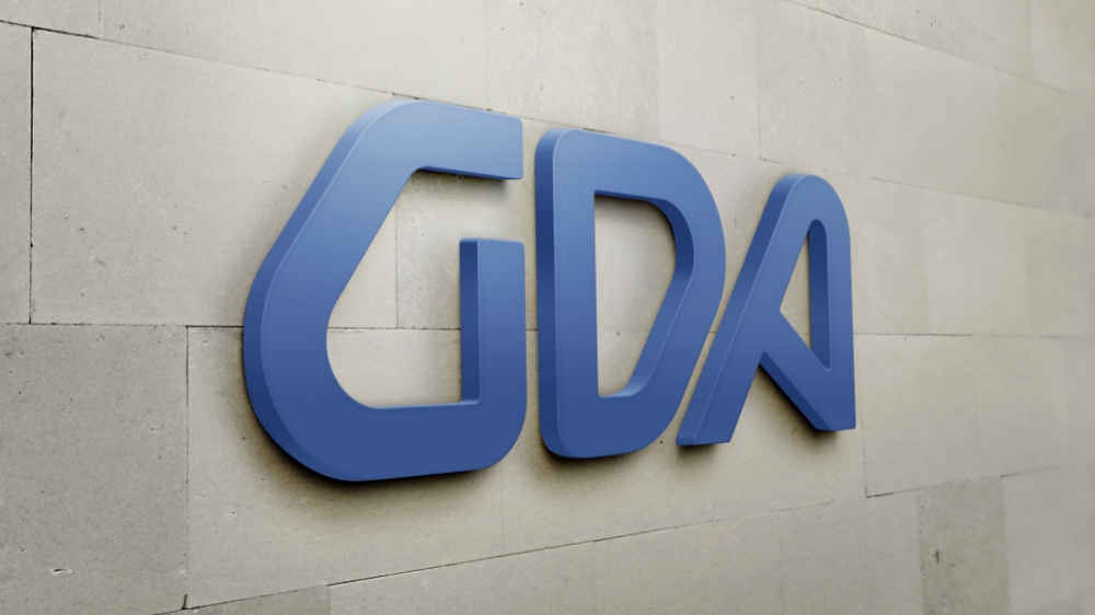
The custom ‘G’, ‘D” and ‘A’ typography of the brandmark and the manner that each of the characters interact with one another in cohesion is used as means of visually expressing how GDA works together, seamlessly and effectively with their clients. The result is a dynamic and modern wordmark.
The brandmark is anchored by the logotype, set in the slab serif font of Atletico Light to form a professional and versatile logo lockup.
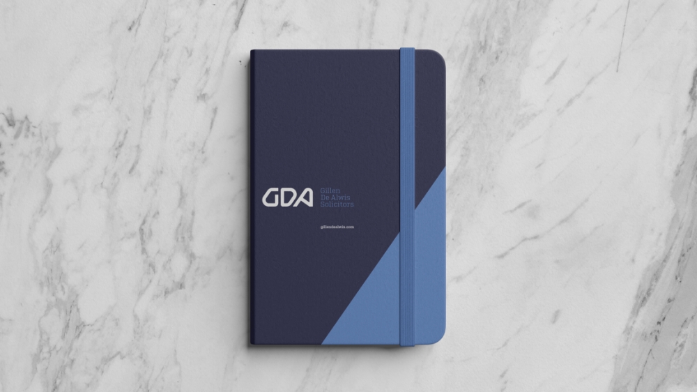
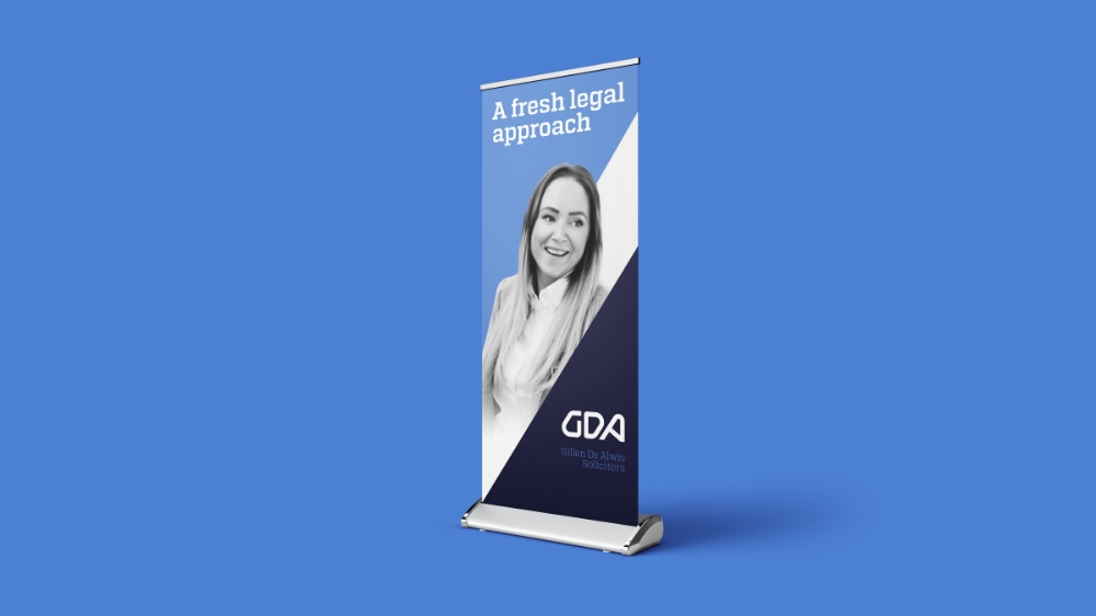
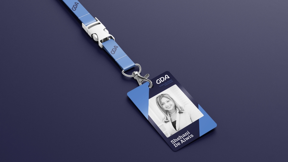
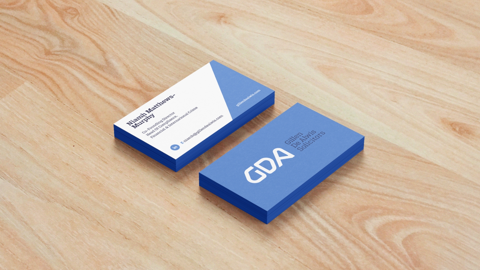
The project further developed the brand into relevant collateral including ID cards, notebooks, display banners, printed booklets and various types of stationery, such as business cards.
